Executive coach, leadership programmes and ceremonies.
An editorial identity for a leadership practice: a masthead rather than a logo, a page rather than a screen, and the confidence to say less. The next evolution of leadership is an inside job.
Logo
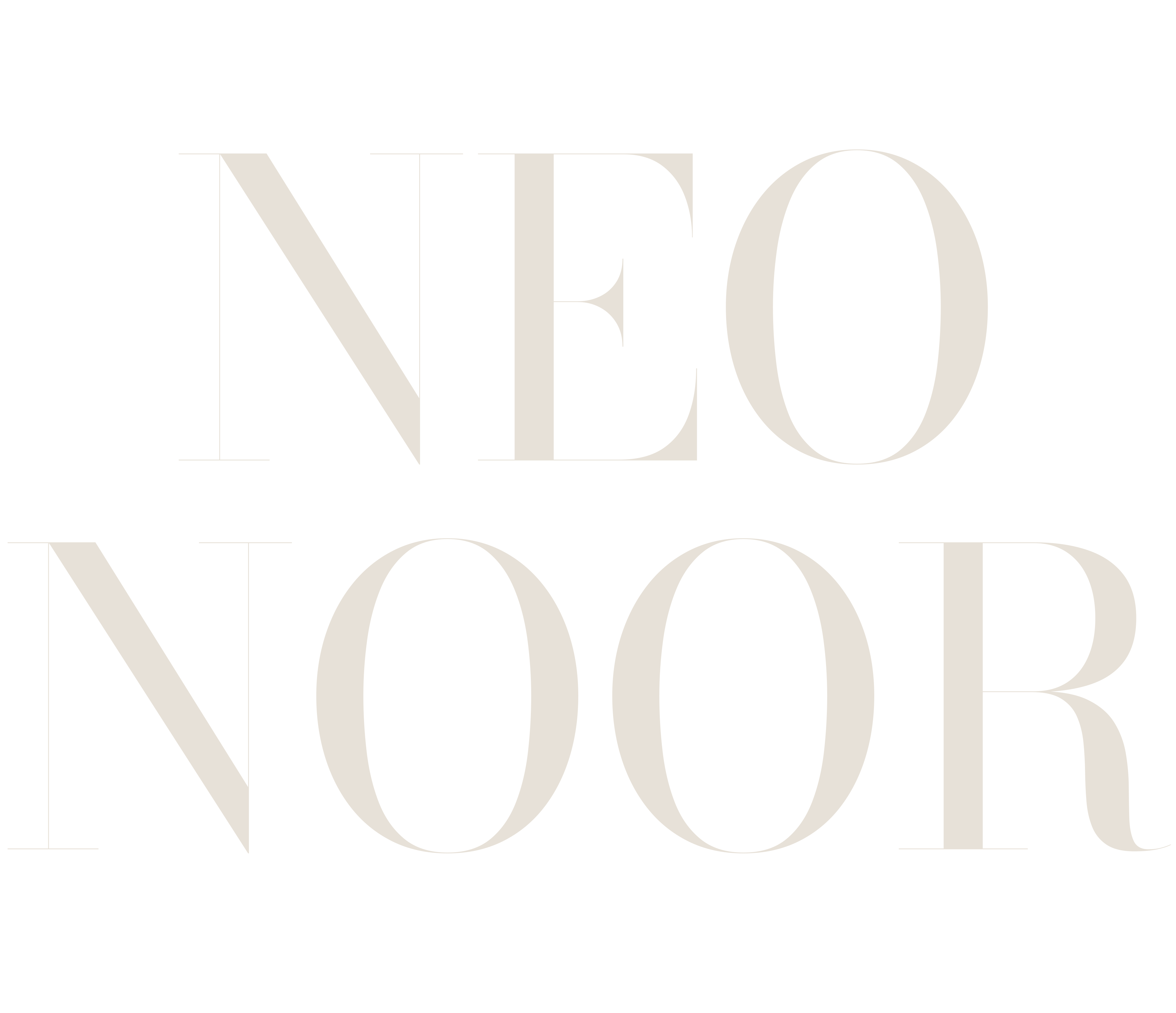
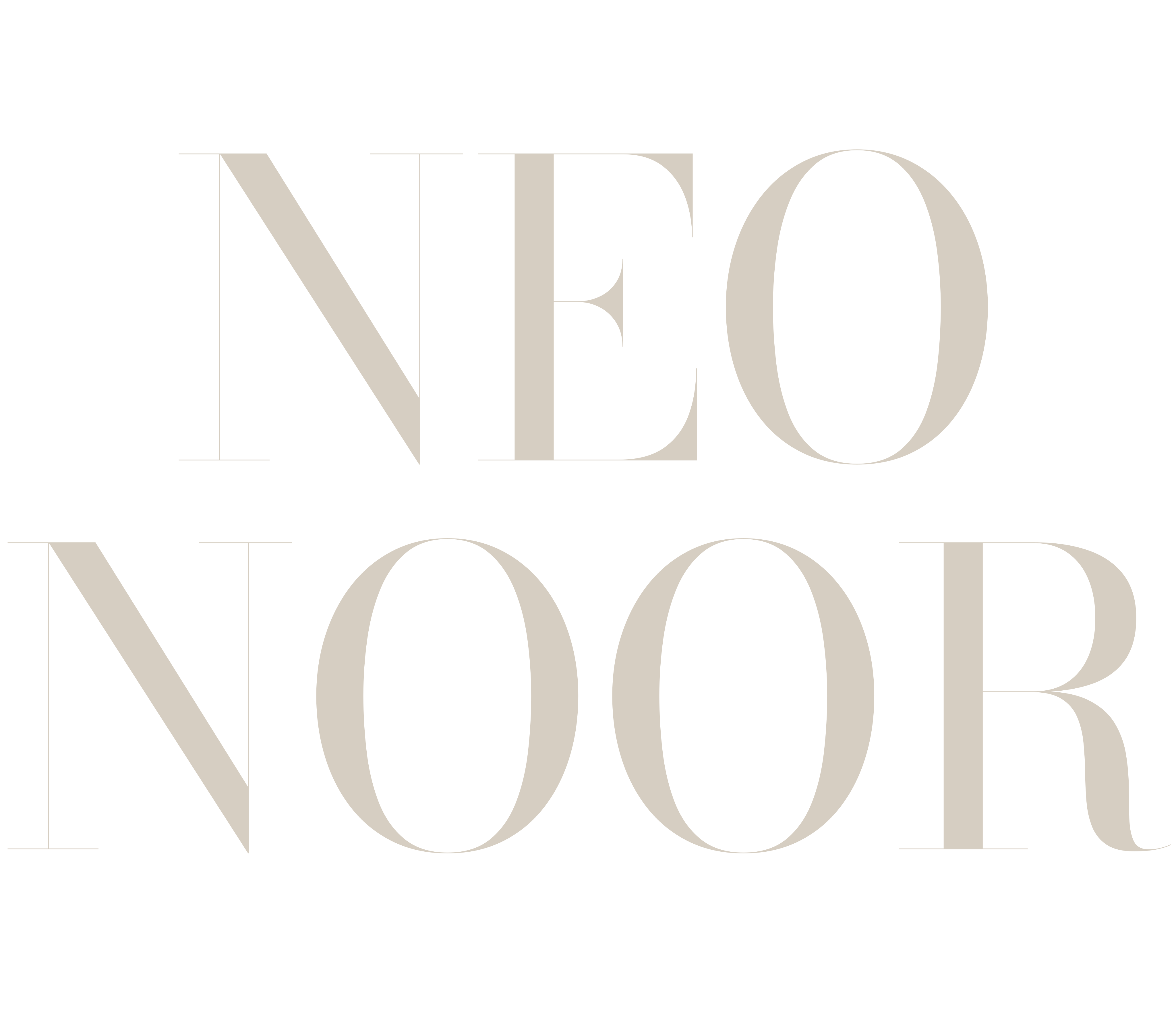
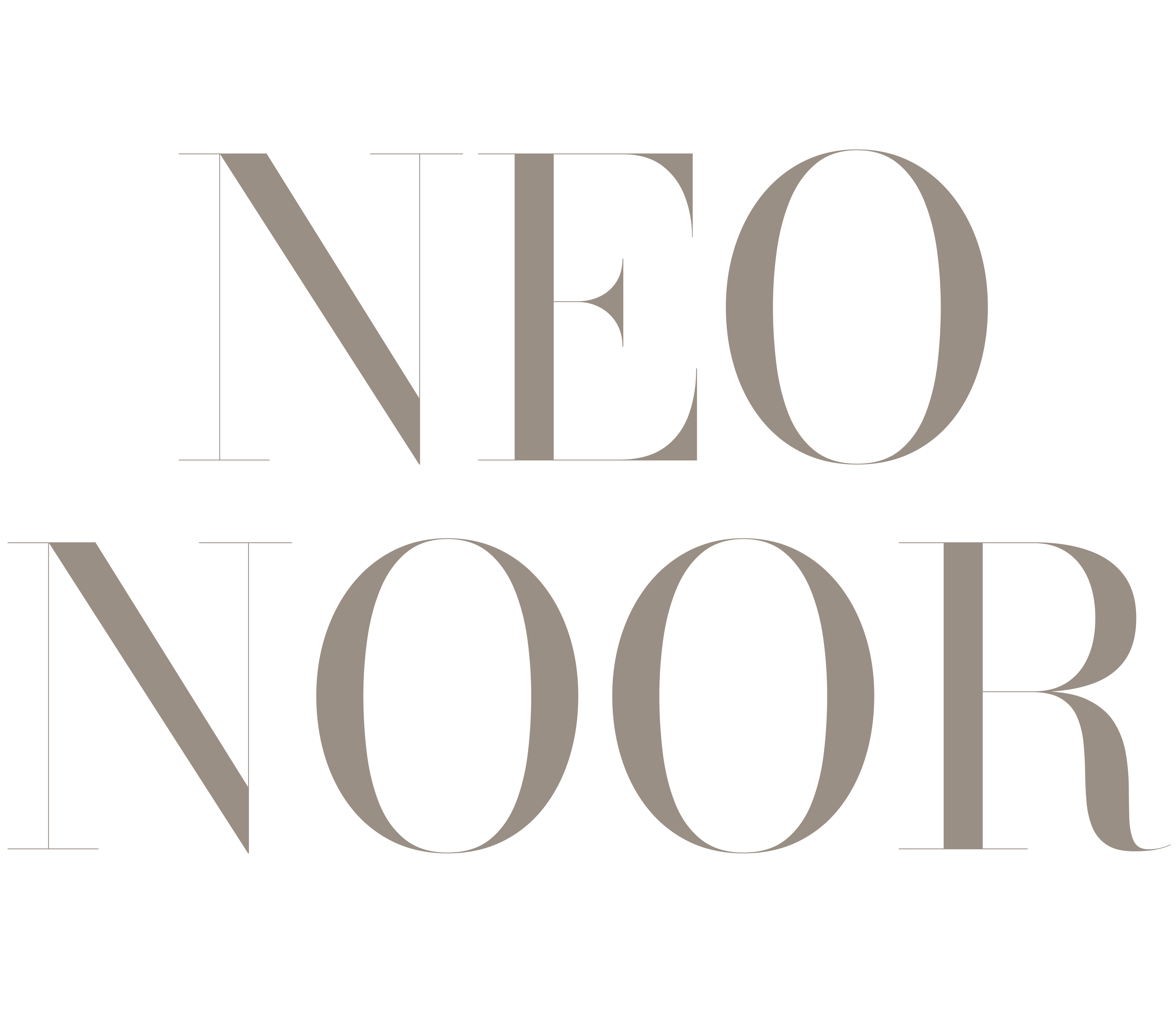
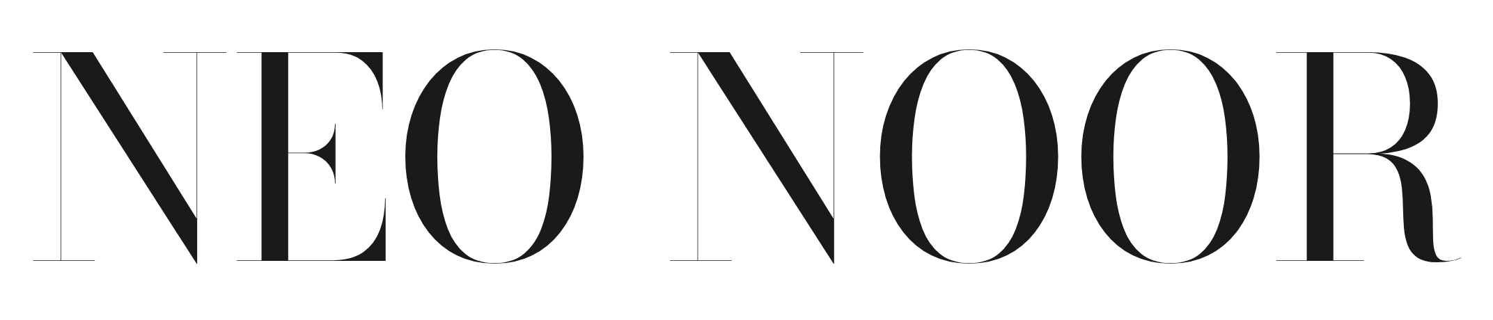
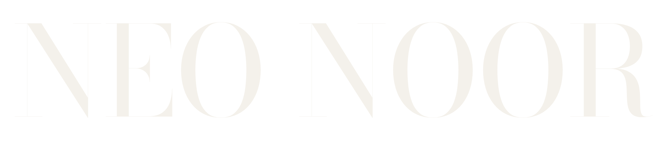
The Neo Noor masthead is the name set in Bodoni Moda at optical size 96, zero letter-spacing, always in capitals. It's used the way a magazine uses its nameplate: large, alone, and never redrawn. Three lockups cover every use.
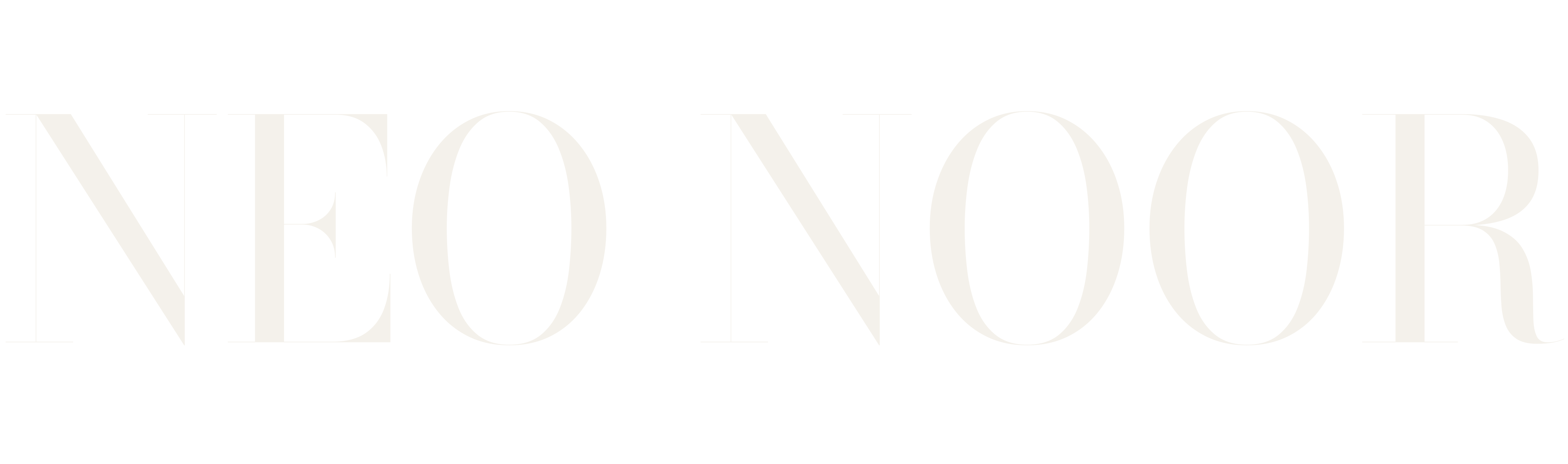
Primary masthead
The default. Use on any ground with enough contrast. On photography use page white or pure white.
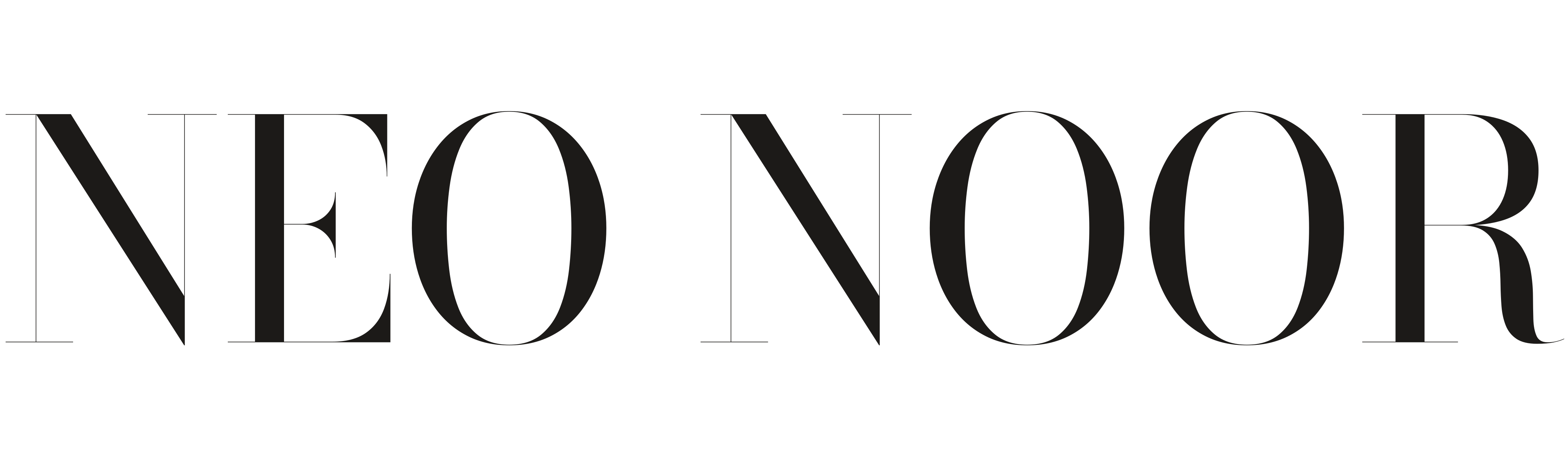

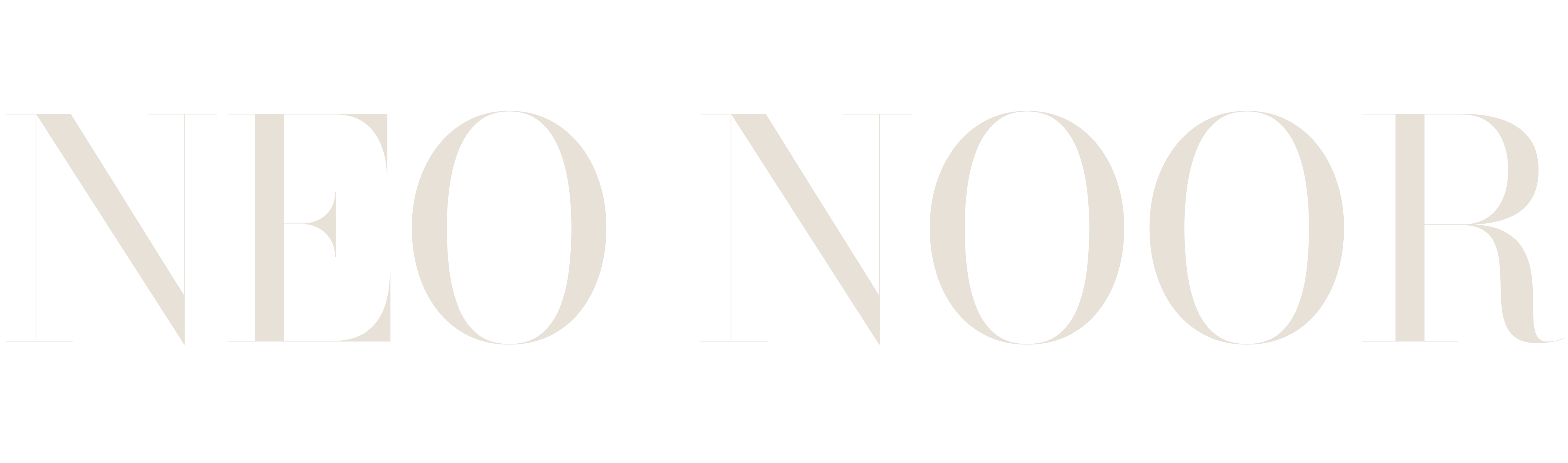
Stacked
For square and portrait formats: social tiles, workbook covers, the podcast artwork.

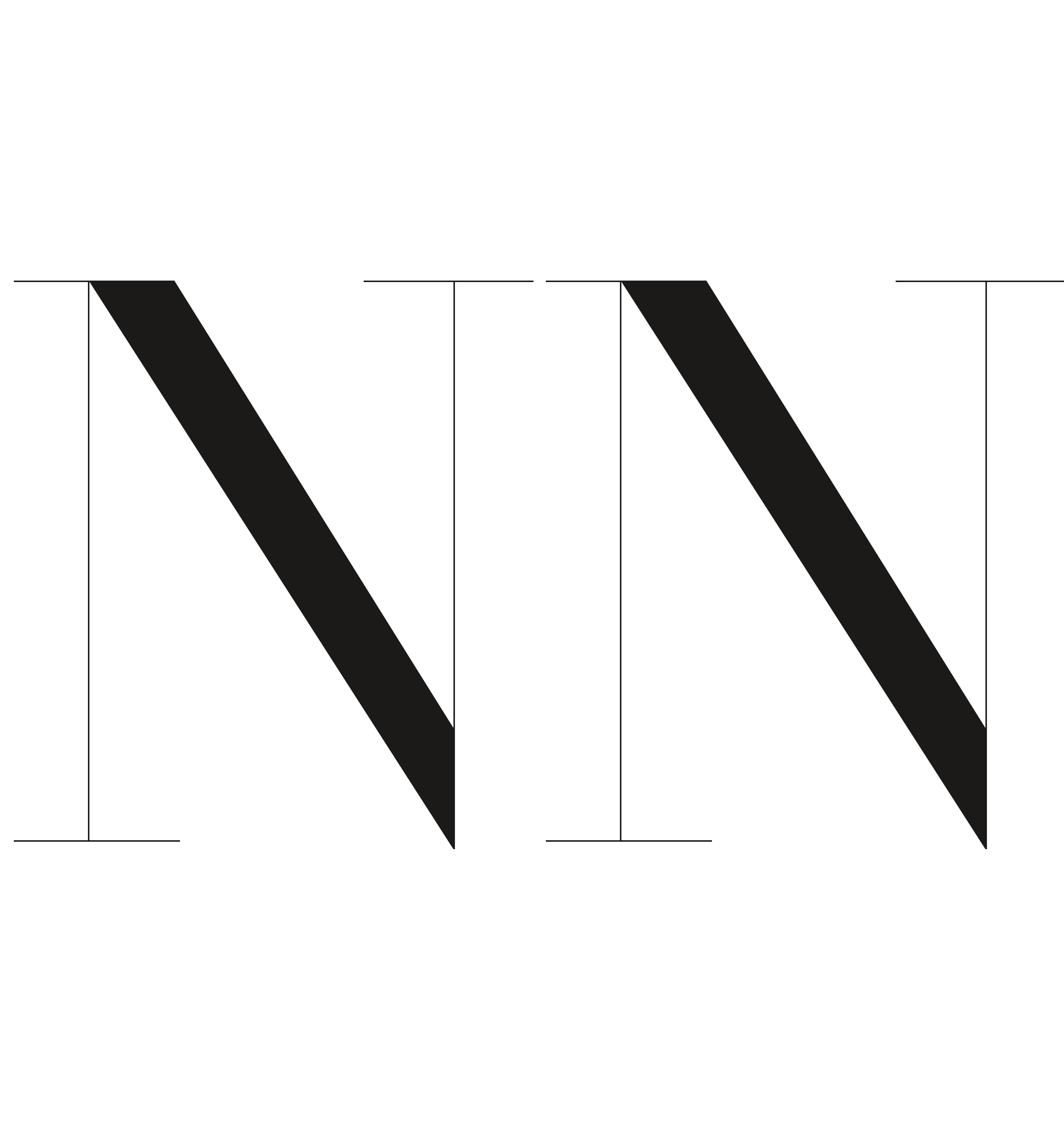
Initials
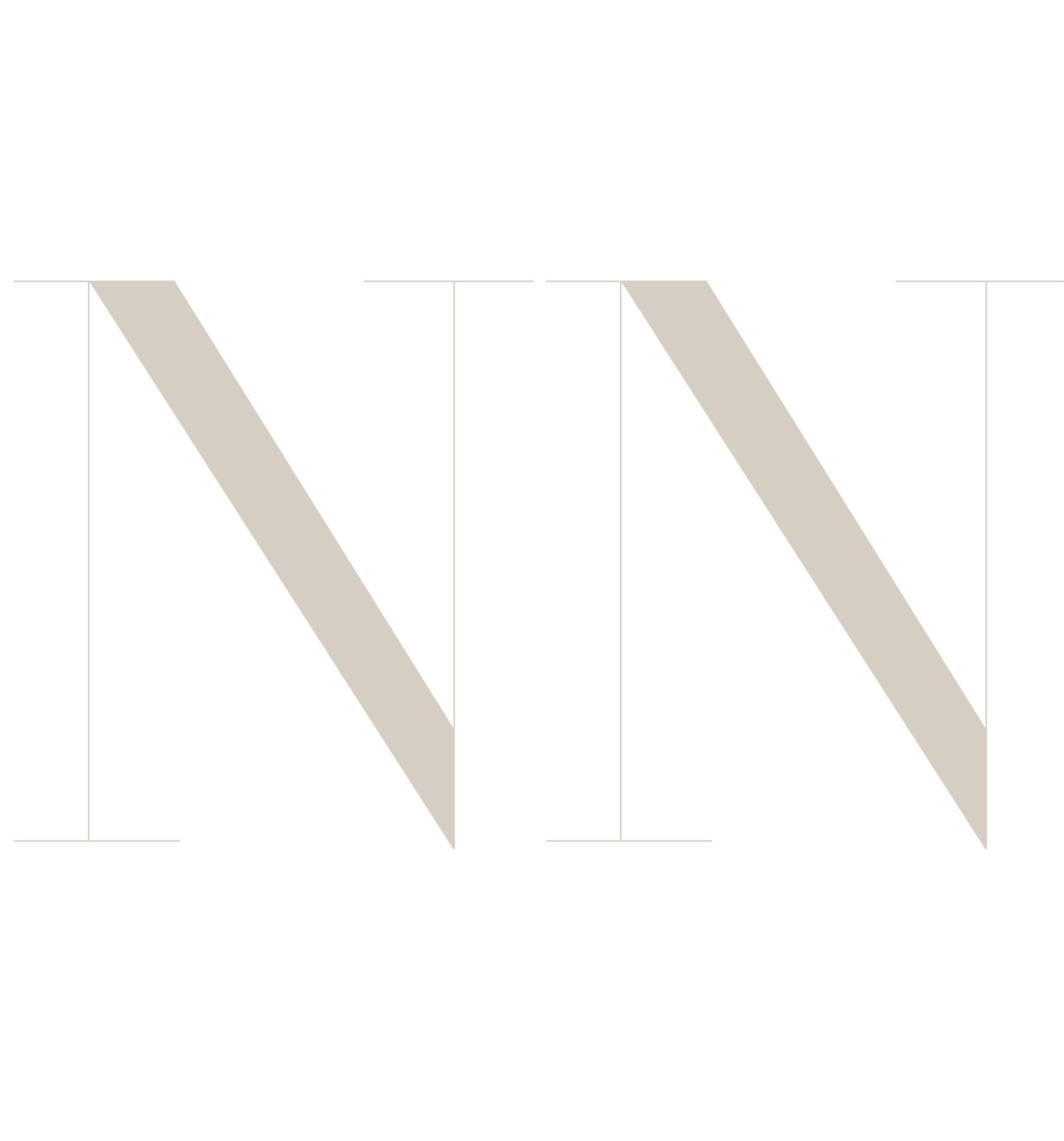
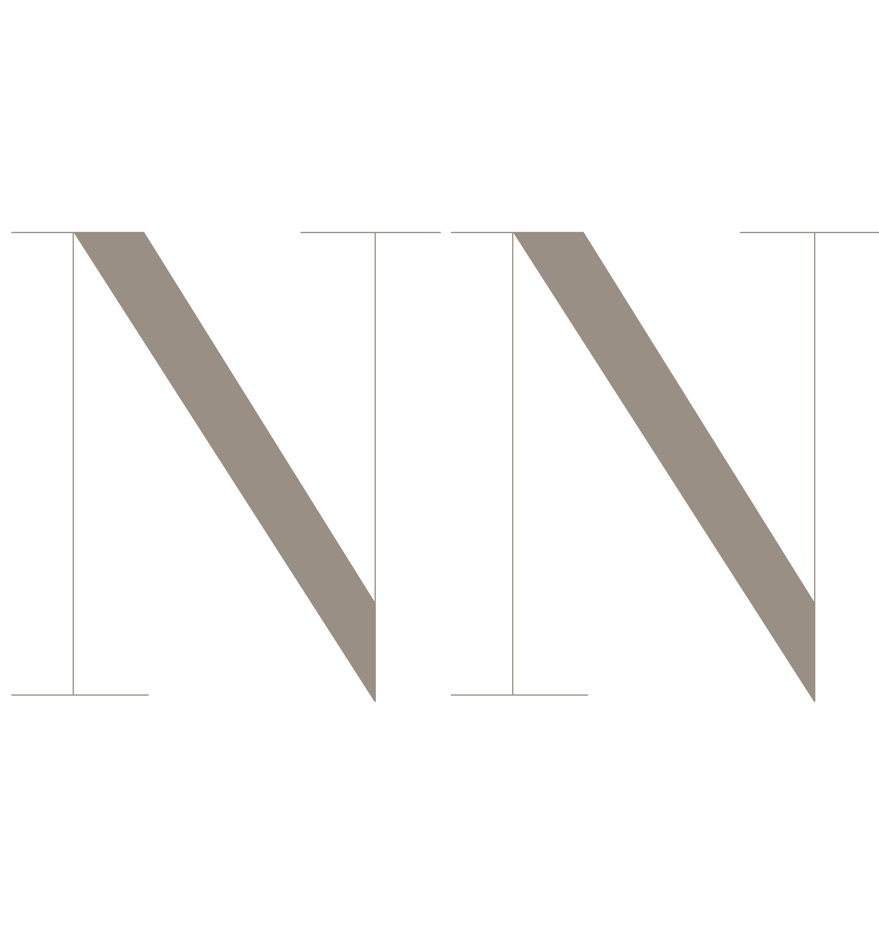
NN for the favicon, profile pictures, the embosser and anything under 30mm wide, where the masthead's hairlines would disappear.



Clear space
Keep a margin around the masthead equal to the height of the letter N on every side. Nothing sits inside it: no tagline, no pillars, no photograph edge.
Don'ts
The masthead is a fixed piece of typography. If it needs changing, use a different lockup rather than altering this one.
No letter-spacing, positive or negative. The lockups are set at zero and stay there.
Only the six supplied colourways. Never gold, never gradients, never a photograph inside the letters.
No outlines, drop shadows, glows, bevels or rotation. On a busy photo, darken the photo, don't decorate the logo.
Use the SVG or PNG files, never the font typed into a layout. The hairlines are tuned to the files.
Colour
Five tones from a printed page: the white of the stock, two warm greys, a taupe, and ink. There is no accent colour. Emphasis comes from scale and contrast, which is what keeps the brand from looking like every other coaching business in the city.
Core. Header, footer, all text, the masthead on light grounds.
- Hex
- #1C1A18
- RGB
- 28 26 24
- CMYK
- 0 7 14 89
The page itself. Site background, print stock, the masthead on ink.
- Hex
- #F4F1EB
- RGB
- 244 241 235
- CMYK
- 0 1 4 4
Section tints, cards, alternate backgrounds. Never for text.
- Hex
- #E7E1D8
- RGB
- 231 225 216
- CMYK
- 0 3 6 9
Rules, borders, image placeholders, tone-on-tone logos on ink.
- Hex
- #D6CEC2
- RGB
- 214 206 194
- CMYK
- 0 4 9 16
Labels, captions, secondary text. Passes contrast on page white at 11px and above.
- Hex
- #9A8F84
- RGB
- 154 143 132
- CMYK
- 0 7 14 40
Pairings
Ink against page white carries the brand. The greys only ever sit next to one of those two, never next to each other as a composition.
Page White
on Ink
Newsprint
on Ink
Typography
Three typefaces, each with one job, all at zero letter-spacing. All three are open-licence Google Fonts, so there's nothing to buy for web, print, social or client work.
Bodoni Moda
Regular, optical size 96. Used for the Neo Noor name and nothing else. It never appears in a heading, a caption or a social post as a typeface, only as the logo files.
Cormorant Garamond
Medium (500) for headings, Regular Italic (400) for emphasis and quotes. Sentence case, never all caps, never bold. It carries the warmth; the masthead carries the authority.
Inter Tight
Light (300) for running text, Regular (400) for navigation and buttons, Medium (500) only for form labels and table headers. Labels in caps at 11px to 12px. Nothing heavier than Medium, anywhere.
A year of coming back to yourself, one week at a time.
Weekly journaling, a monthly hot seat call, a voice note from Noona every week and one activation day a quarter. USD 178 a month, or USD 1,999 upfront.
Every logo colourway and font on this page downloads individually from its link. The complete pack (SVG, PNG and TTF in one folder) is supplied separately as a zip.
Load all three with one link:https://fonts.googleapis.com/css2?family=Bodoni+Moda:opsz,wght@6..96,400&family=Cormorant+Garamond:ital,wght@0,400;0,500;1,400&family=Inter+Tight:wght@300;400;500&display=swap
Photography
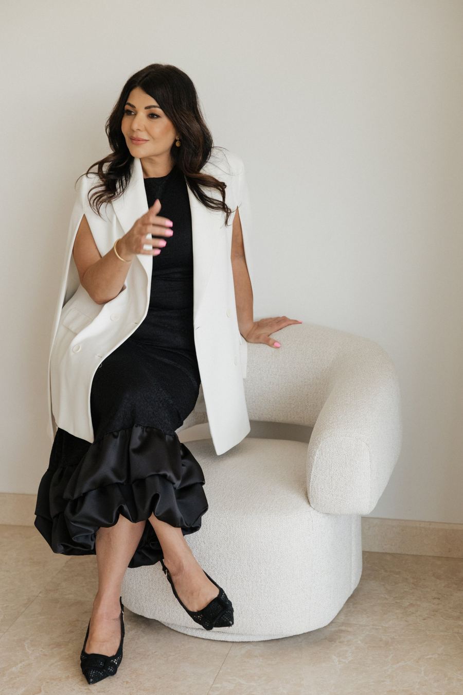
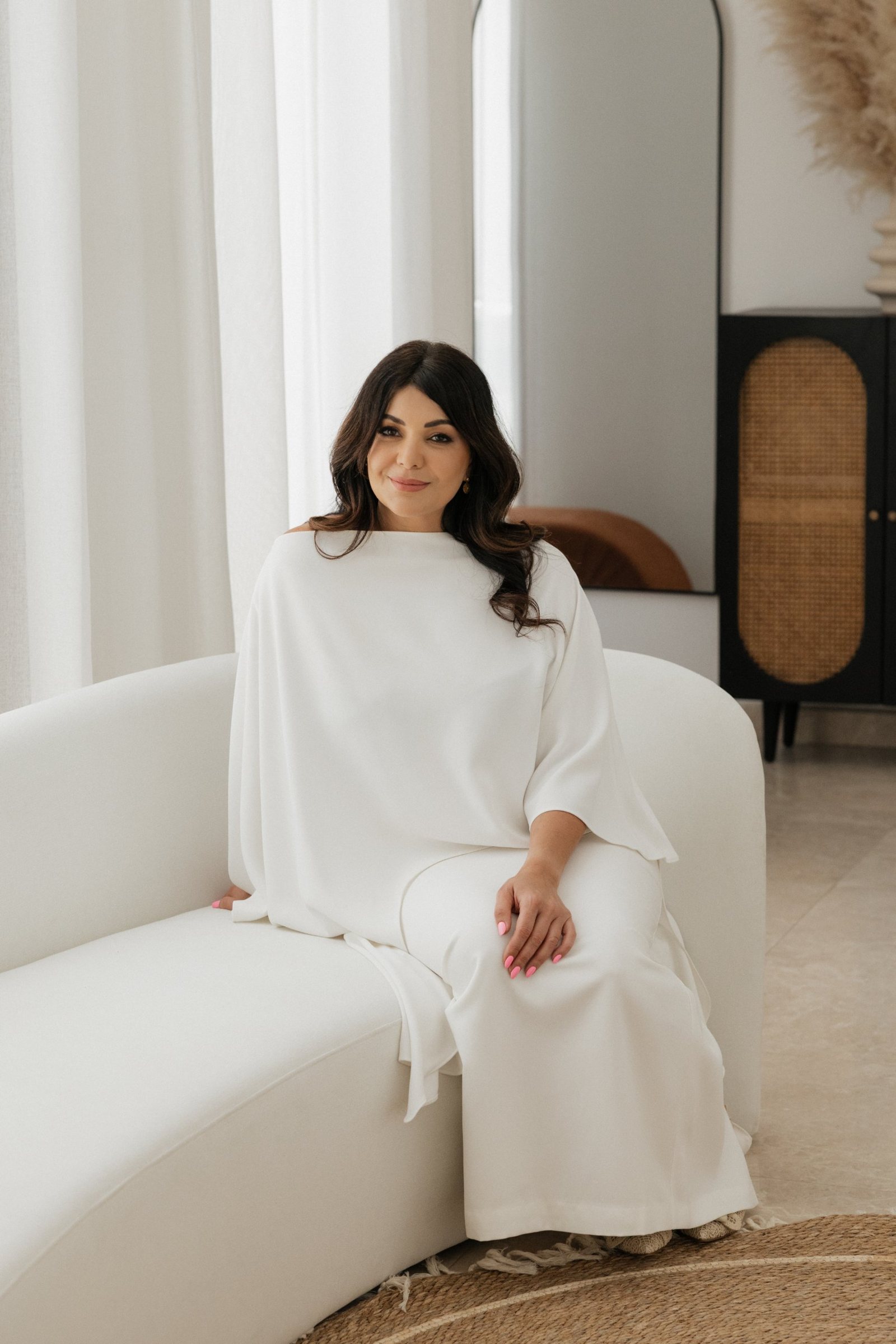
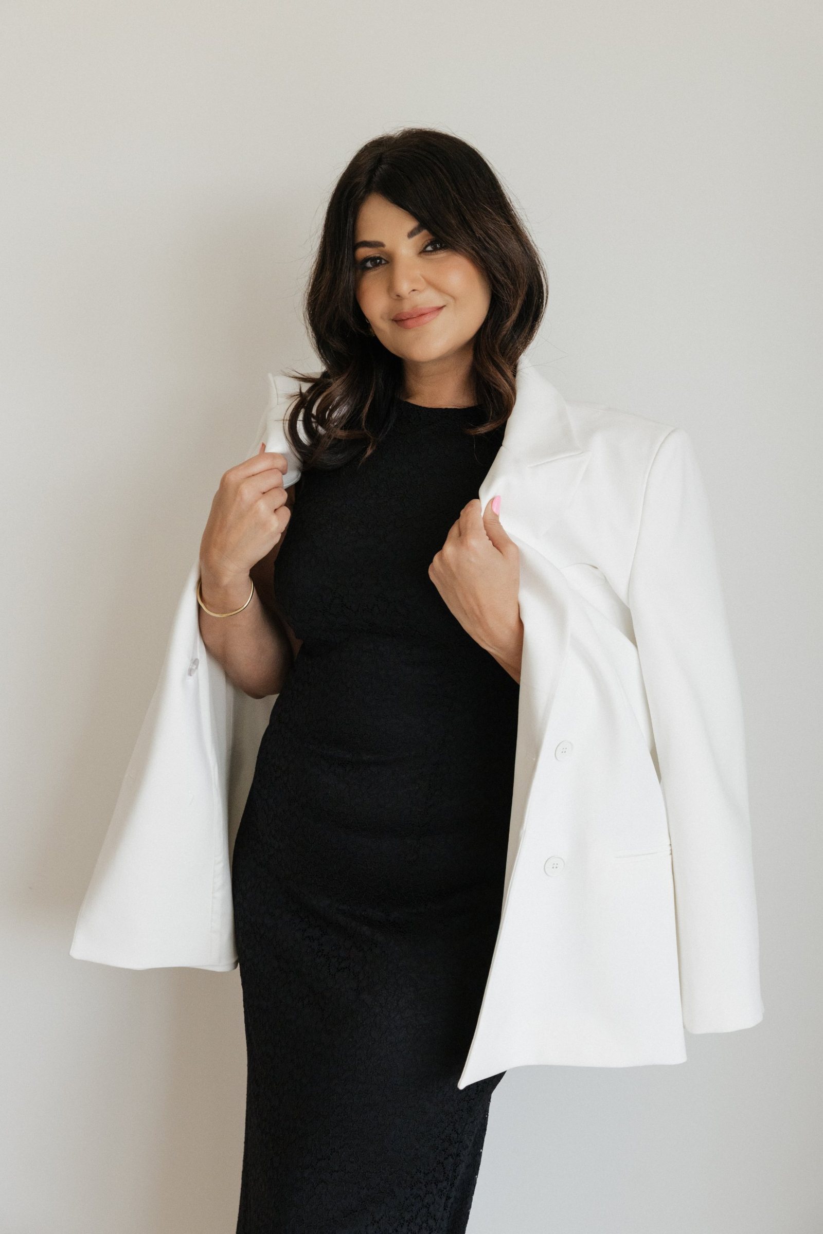
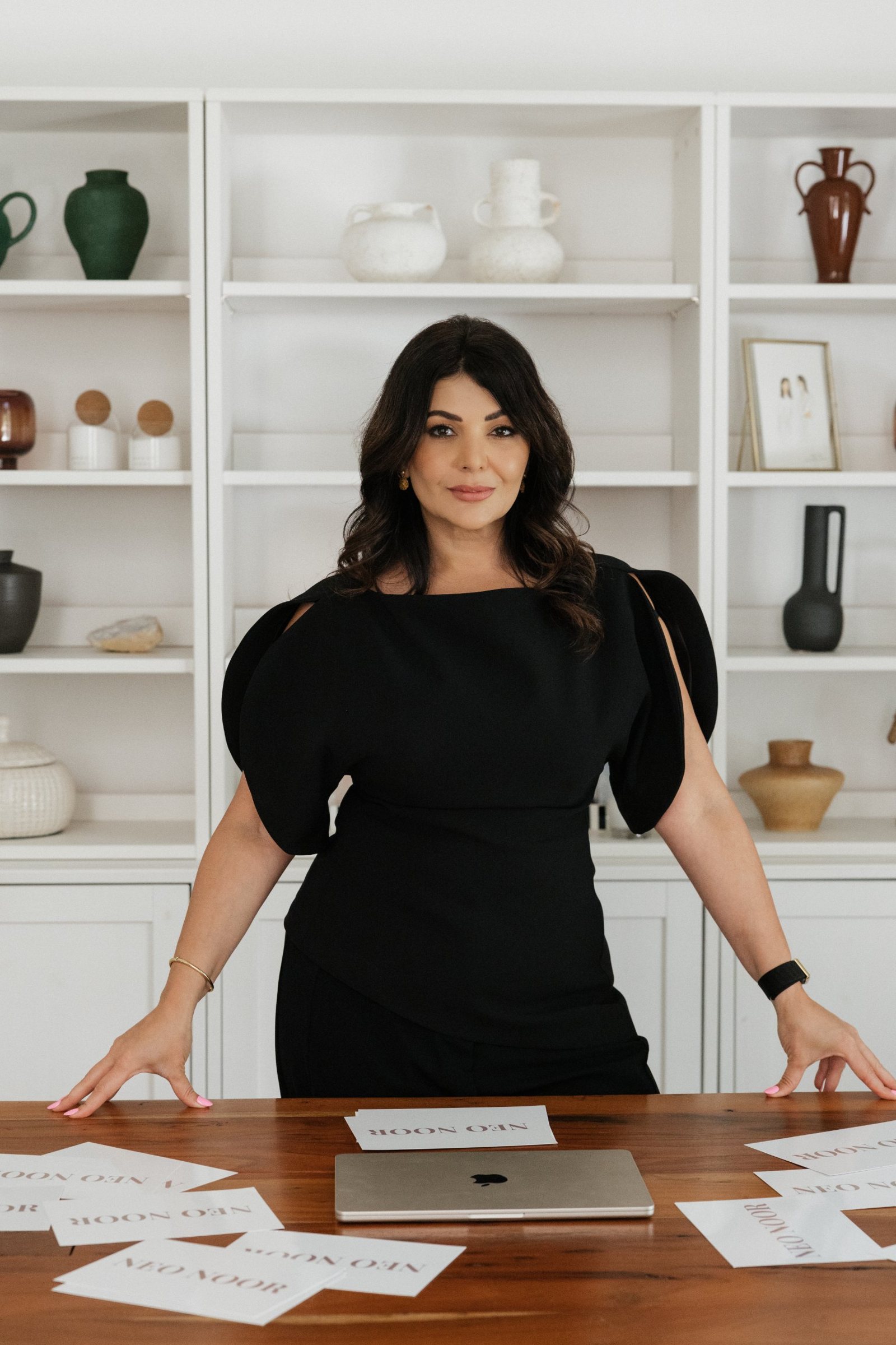
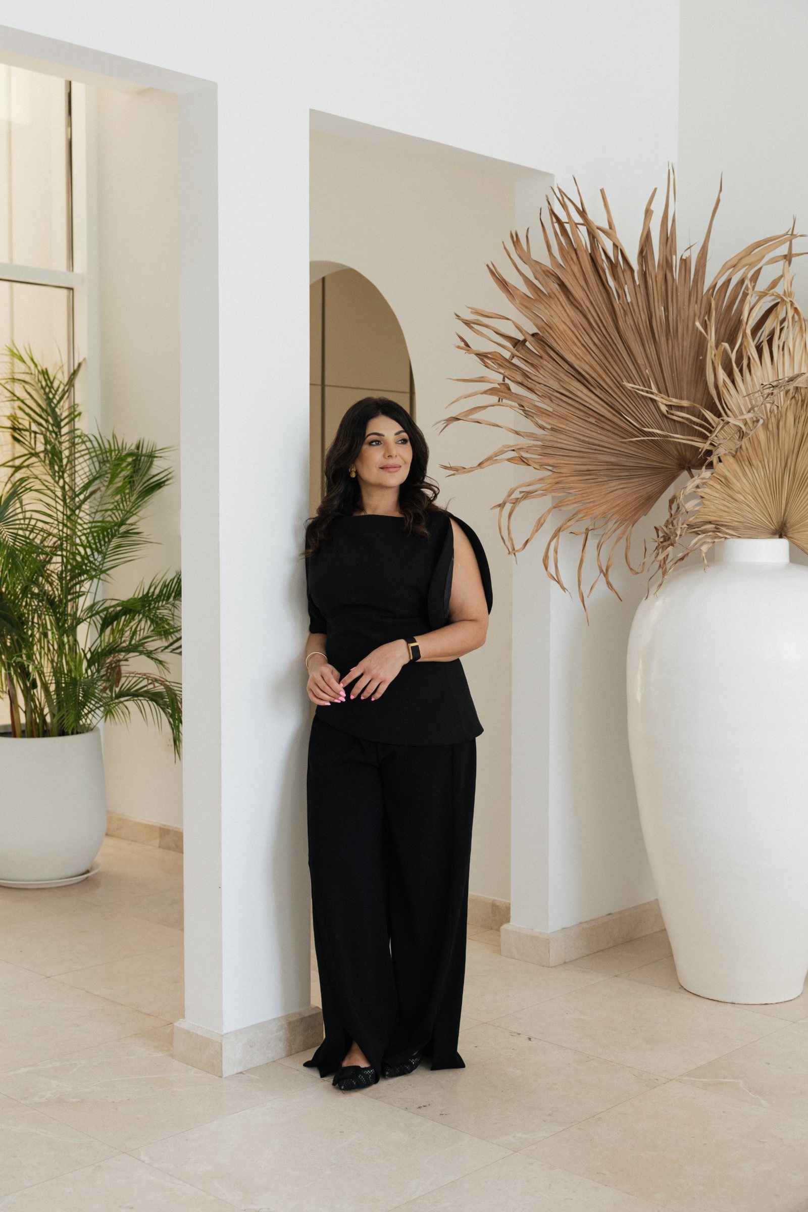
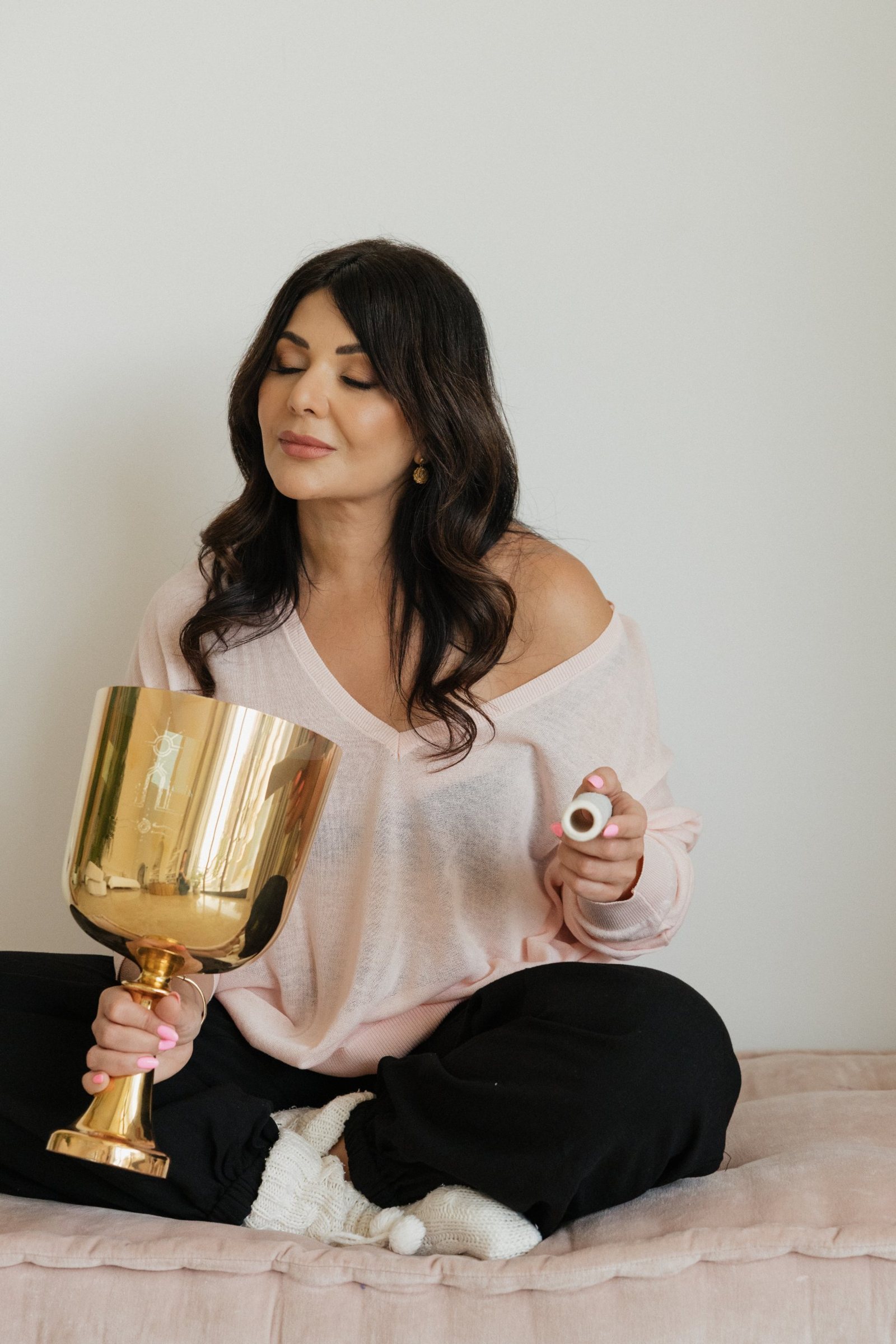
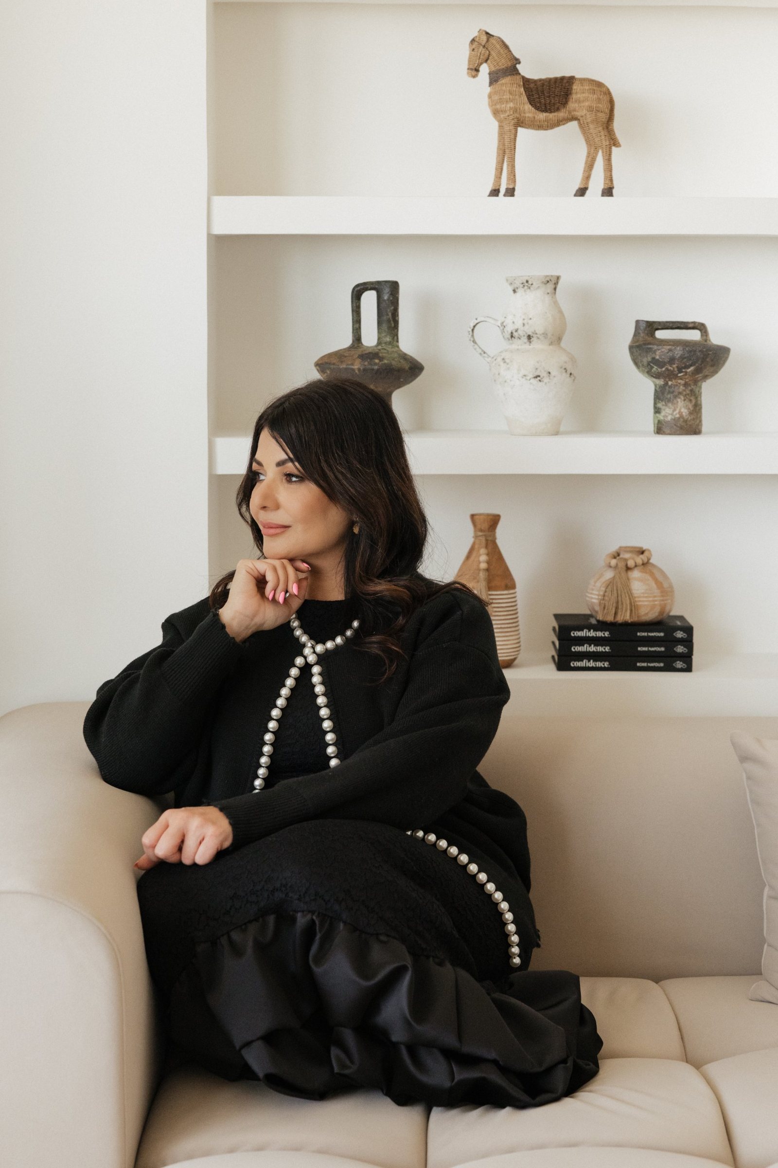
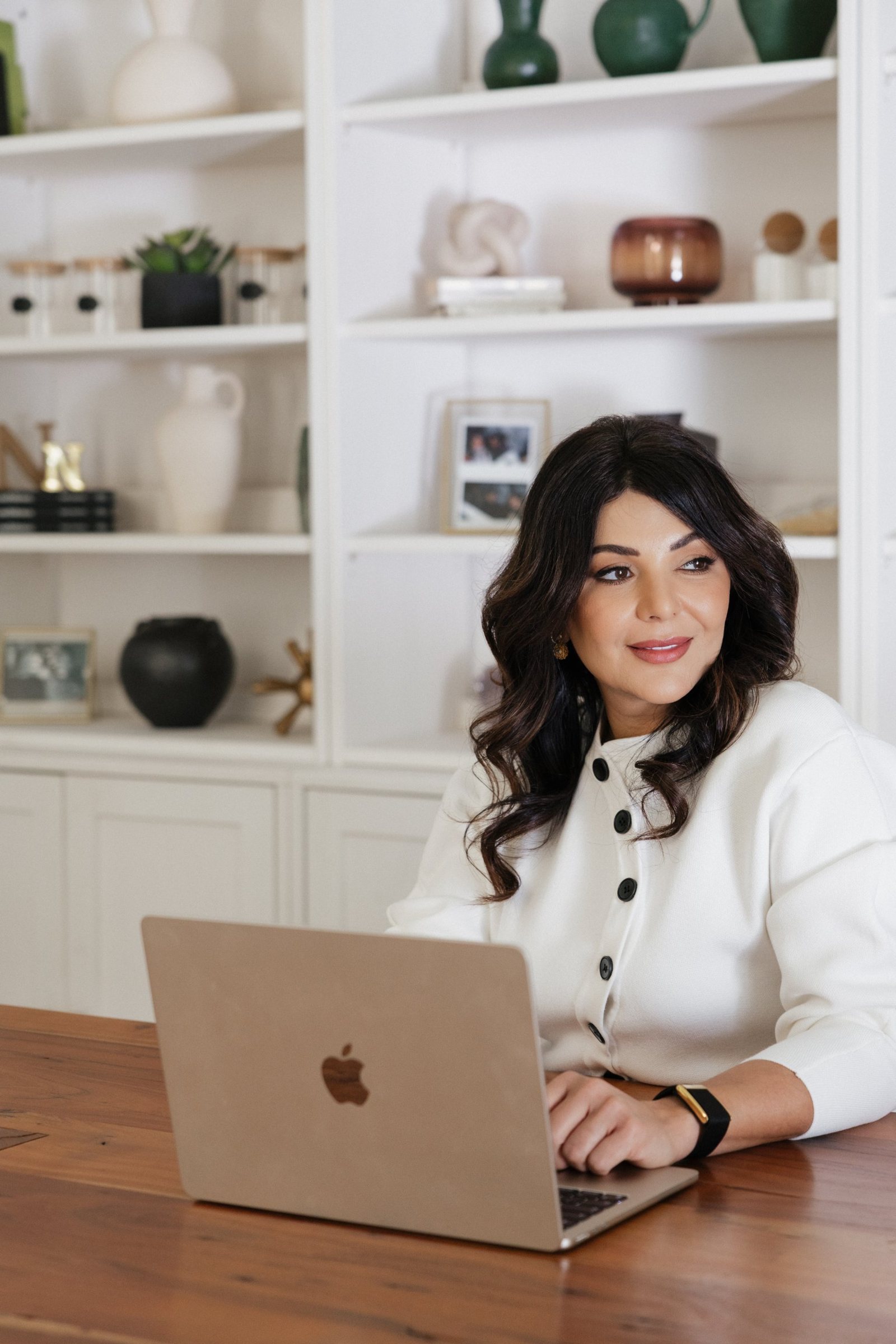
Editorial portraiture, shot like a magazine feature rather than a headshot. Noona in the frame as a leader at ease, never performing to camera.
- Natural daylight, soft and directional. No flash, no studio backdrops.
- Interiors in cream, stone, bouclé and marble. Dubai, but the quiet version of it.
- Wardrobe mostly in black, white and ivory. One warm tone in a frame is fine; never a print.
- Gaze mostly off camera; one direct look per shoot is enough.
- Negative space on one side of every hero image, for the masthead to sit in.
- Colour grade warm and low in contrast, so the ink type does the contrast work.
Image library
Eight frames from the June 2026 shoot, web-sized at 1600px on the short edge. The full-resolution originals live in the shared Drive folder.

Materials
What the brand feels like in the hand: the references for print, packaging and the room itself.
Applications
How the system behaves once it leaves this page. Each of these follows the same three rules: masthead large and alone, one typeface per job, and ink on page white.
neonoor.com · Dubai
with Noona Nafousi
Neo Noor · Dubai
neonoor.com
Come home to yourself.
Neo Noor · Brand guidelines · Edition one · 2027